> ## Documentation Index
> Fetch the complete documentation index at: https://skelementorcss.com/llms.txt
> Use this file to discover all available pages before exploring further.

# Quickstart

> Install Skelementor, import the Skelementor Preset, learn how utilities are organized, and apply classes in Elementor.

<div className="sk-theme-hero not-prose">
  <img style={{ borderRadius: "0.5rem", width: "100%", height: "auto" }} src="https://mintcdn.com/skelementor/2_yOBMnxcHRd_L04/images/quickstart-light.png?fit=max&auto=format&n=2_yOBMnxcHRd_L04&q=85&s=d8ab7aae924b66553fc39b577a99a727" className="dark:hidden block" alt="Skelementor Quickstart - Get up and running in 3 simple steps" width="2258" height="1204" data-path="images/quickstart-light.png" />

  <img style={{ borderRadius: "0.5rem", width: "100%", height: "auto" }} src="https://mintcdn.com/skelementor/2_yOBMnxcHRd_L04/images/quickstart-dark.png?fit=max&auto=format&n=2_yOBMnxcHRd_L04&q=85&s=8fd75230d191a1c8df489bcdc1475be7" className="hidden dark:block" alt="Skelementor Quickstart - Get up and running in 3 simple steps" width="2258" height="1204" data-path="images/quickstart-dark.png" />
</div>

## Get Started in 3 Steps

Use this page when you want the fastest route from installing Skelementor to working classes inside Elementor.

<Card title="View Import Guide" icon="book-open" href="/getting-started/quickstart" horizontal>
  Need the longer walkthrough? Open the full import guide.
</Card>

### Step 1: Install the Plugin

<Steps>
  <Step title="Install the plugin">
    Download, upload, and activate the Skelementor ZIP in WordPress. Use the
    full [installation guide](/getting-started/installation) if you need the
    detailed requirements, upload methods, or troubleshooting steps.
  </Step>
</Steps>

<Callout icon="puzzle-piece" color="#8f1d7d">
  <div className="sk-elementor-callout-text">
    **Requirements:** WordPress **6.9+**, PHP 7.4+, and Elementor **v4** with the Atomic Editor enabled.
  </div>
</Callout>

### Step 2: Import Your First CSS

<Steps>
  <Step title="Import the Skelementor Preset">
    Use the built-in **Skelementor Preset** for the standard first import. It
    adds **976 classes** for Elementor’s default desktop, tablet, and mobile
    breakpoints while staying within Elementor’s native **1000-class** limit.
  </Step>
</Steps>

### Step 3: Use Classes in Elementor

<Steps>
  <Step title="Use classes in Elementor">
    Open any page with Elementor, add an atomic element, and assign imported
    utility classes in the class field to confirm the styles render correctly.
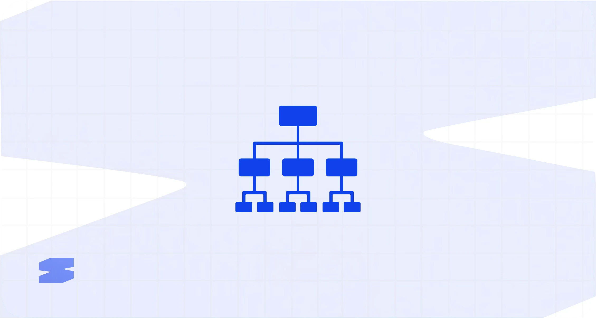
  </Step>
</Steps>

<div className="sk-theme-hero not-prose">
  <img style={{ borderRadius: "0.5rem", width: "100%", height: "auto" }} src="https://mintcdn.com/skelementor/2_yOBMnxcHRd_L04/images/framework-light.png?fit=max&auto=format&n=2_yOBMnxcHRd_L04&q=85&s=e4bbf984ec2083e64f451e8555505f67" className="dark:hidden block" alt="Skelementor Utility Framework - Skelementor Preset and utility categories for Elementor v4" width="2258" height="1204" data-path="images/framework-light.png" />

  <img style={{ borderRadius: "0.5rem", width: "100%", height: "auto" }} src="https://mintcdn.com/skelementor/2_yOBMnxcHRd_L04/images/framework-dark.png?fit=max&auto=format&n=2_yOBMnxcHRd_L04&q=85&s=c9cf7120fa90906998ac4f696d772f9b" className="hidden dark:block" alt="Skelementor Utility Framework - Skelementor Preset and utility categories for Elementor v4" width="2258" height="1204" data-path="images/framework-dark.png" />
</div>

## One Framework

Skelementor ships one stable built-in import path for day-one setup: the **Skelementor Preset**. It adds **976 classes** for Elementor’s default desktop, tablet, and mobile breakpoints.

The bundled `skelementor-utilities.css` file remains the source artifact for reference, inspection, and regeneration workflows. Where a class family uses responsive `clamp()` values (for example **`text-*`**), that behavior is built in and does not need a separate naming layer. **`leading-*`** uses fixed pixel `line-height` in the bundle, not `clamp()`.

## Framework Categories

<CardGroup cols={3}>
  <Card title="Typography" icon="font" href="/concepts/typography">
    Responsive `text-*` scale, fixed pixel `leading-*`, weights, tracking, alignment, and text styling.
  </Card>

  <Card title="Layout" icon="table-layout" href="/concepts/layout">
    Display, overflow, object-fit, aspect-ratio, positioning, z-index, and responsive structural suffixes.
  </Card>

  <Card title="Spacing" icon="arrows-left-right-to-line" href="/concepts/spacing">
    Margin, padding, and gap utilities built around the bundled spacing tokens.
  </Card>

  <Card title="Sizing" icon="arrows-maximize" href="/concepts/sizing">
    Fractional widths, screen-height helpers, and responsive max-width utilities.
  </Card>

  <Card title="Colors" icon="eye-dropper-half" href="/concepts/colors">
    Text, background, and border color helpers aligned with the bundled tokens.
  </Card>

  <Card title="Borders" icon="border-right" href="/concepts/borders">
    Border widths, styles, radius utilities, and the shipped border color set.
  </Card>

  <Card title="Effects" icon="sparkle" href="/concepts/effects">
    Full opacity scale for layering, disabled states, and visual depth.
  </Card>

  <Card title="Filters" icon="wand-magic-sparkles" href="/concepts/filters">
    Blur, brightness, contrast, saturation, and color-shift utilities.
  </Card>

  <Card title="Flexbox" icon="table-cells-large" href="/flexbox/flex">
    Direction, wrap, alignment, order, grow/shrink, gap, and responsive structural variants.
  </Card>

  <Card title="Components" icon="hand-pointer" href="/concepts/components">
    Preset button classes and the broader component patterns they support.
  </Card>

  <Card title="Breakpoints" icon="ruler" href="/concepts/responsive-utilities">
    The shipped `--on-*` suffix system for structural classes at each breakpoint.
  </Card>

  <Card title="Fluid scaling" icon="arrows-up-down-left-right" href="/concepts/fluid-scaling">
    How `clamp()`-based scaling works across bundled typography and spacing families.
  </Card>

  <Card title="Variables" icon="brackets-curly" href="/concepts/variables">
    CSS custom properties, bundled tokens, and how variables fit into imports.
  </Card>
</CardGroup>

## Related Guides

<CardGroup cols={2}>
  <Card title="Installation" icon="download" href="/getting-started/installation">
    Full installation methods, requirements, and setup checks.
  </Card>

  <Card title="Import Guide" icon="book-open" href="/getting-started/quickstart">
    Detailed class and variable import walkthrough.
  </Card>
</CardGroup>
